1. Hero overview
One strong brand overview mockup - logo + colour palette + homepage preview
This gives an immediate summary of the project.
One strong brand overview mockup - logo + colour palette + homepage preview
This gives an immediate summary of the project.
A strategic and human identity for transformation
Jenny Padovani Souto came to the project with over 15 years of experience in business transformation, finance, operations and systemic mentorship - and a clear need to bring that expertise into one coherent brand.
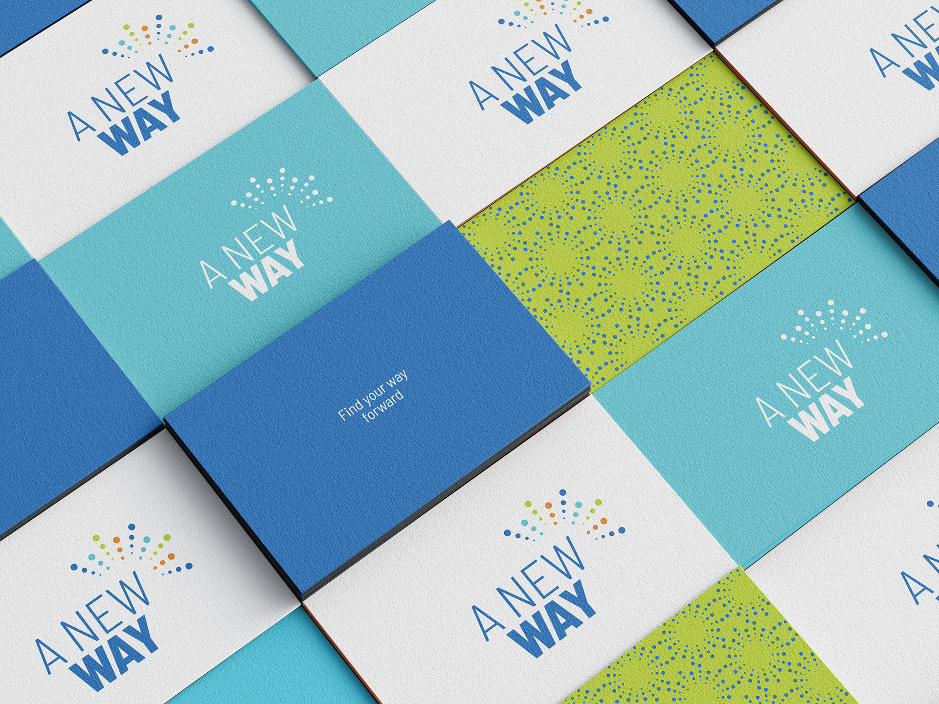
2. Identity system
One composed image with:
logo
tagline
colour palette
typography
This replaces 3 separate images and shows the visual foundation clearly.
This replaces 3 separate images and shows the visual foundation clearly.
A New Way was created to support companies, business owners and individuals through moments of change. The brand brings together several areas of work, from business creation and process optimisation to strategic guidance, corporate training and systemic mentorship.
The challenge was not a lack of expertise, but the need to organise a broad and valuable offer into a brand that felt clear, credible and easy to understand. A New Way needed to feel strategic without becoming cold, and human without becoming vague. It had to speak to different audiences while keeping one central message: change becomes easier when there is structure, clarity and guidance.
The visual direction was built around the idea of finding a new way forward. The identity combines a clear typographic logo with a colourful dotted symbol, suggesting movement, connection and different possible paths. The colour palette brings energy and optimism, while the layout system creates a sense of order, trust and progression.
The website was designed as a guided journey through the brand. It introduces the main promise, reflects the challenges the audience may be facing, presents the services clearly, and then organises the offer into three paths: companies, business owners and individuals. This structure helps each visitor recognise where they are and understand how A New Way can support them.
The final brand gives Jenny a clear and flexible foundation for communication: a visual identity, website and brand language that feel professional, warm and purposeful. More than presenting a list of services, the project helps position A New Way as a guide for meaningful transformation - moving people and businesses from complexity to clarity, and from intention to action.
3. Website main screens
One mockup composition with 2–3 key desktop screens
For example:
For example:
homepage
services“Let’s work together” / audience section
This shows the website structure without needing many separate screenshots.
This shows the website structure without needing many separate screenshots.
4. Mobile experience
One image with 2–3 mobile screens
For example:
For example:
homepage
services
booking / CTA section
5. Brand applications
One composed image with 2–3 applications
Choose the strongest, such as:
Choose the strongest, such as:
social media post(s)
proposal / service guide
simple business card or email signature
I’d prioritise proposal/service guide + social posts.
I’d prioritise proposal/service guide + social posts.
6. Final brand overview
One closing mockup with several touchpoints together
For example:
For example:
laptop
phone
printed brand piece / service guide
colour cards
This closes the page with a complete brand world.
This closes the page with a complete brand world.
OUR ROLE
Brand Strategy • Brand Identity • Visual Direction • Communication Design • Website Design • Webflow Implementation • Digital Experience • Brand Applications • Consulting Brand Design